SpotifySend
SpotifySend
& Other Friend-Centric Redesign
BLURB
Every Monday morning, I am giddied with excitement as I put my headphones on, enthusiastic for what euphony awaits me. My day is spent sneaking in time to blast each new song a little too loud. I want to feel the vibration of every drop, hear each minuscule element that may be missed, and linger over soft-spoken lyrics. Then, I obsess. I fall down a rabbit hole of listening to the favorites of my Discovery Weekly playlist on repeat, familiarizing myself with the exact moment that made me fall in love with it.
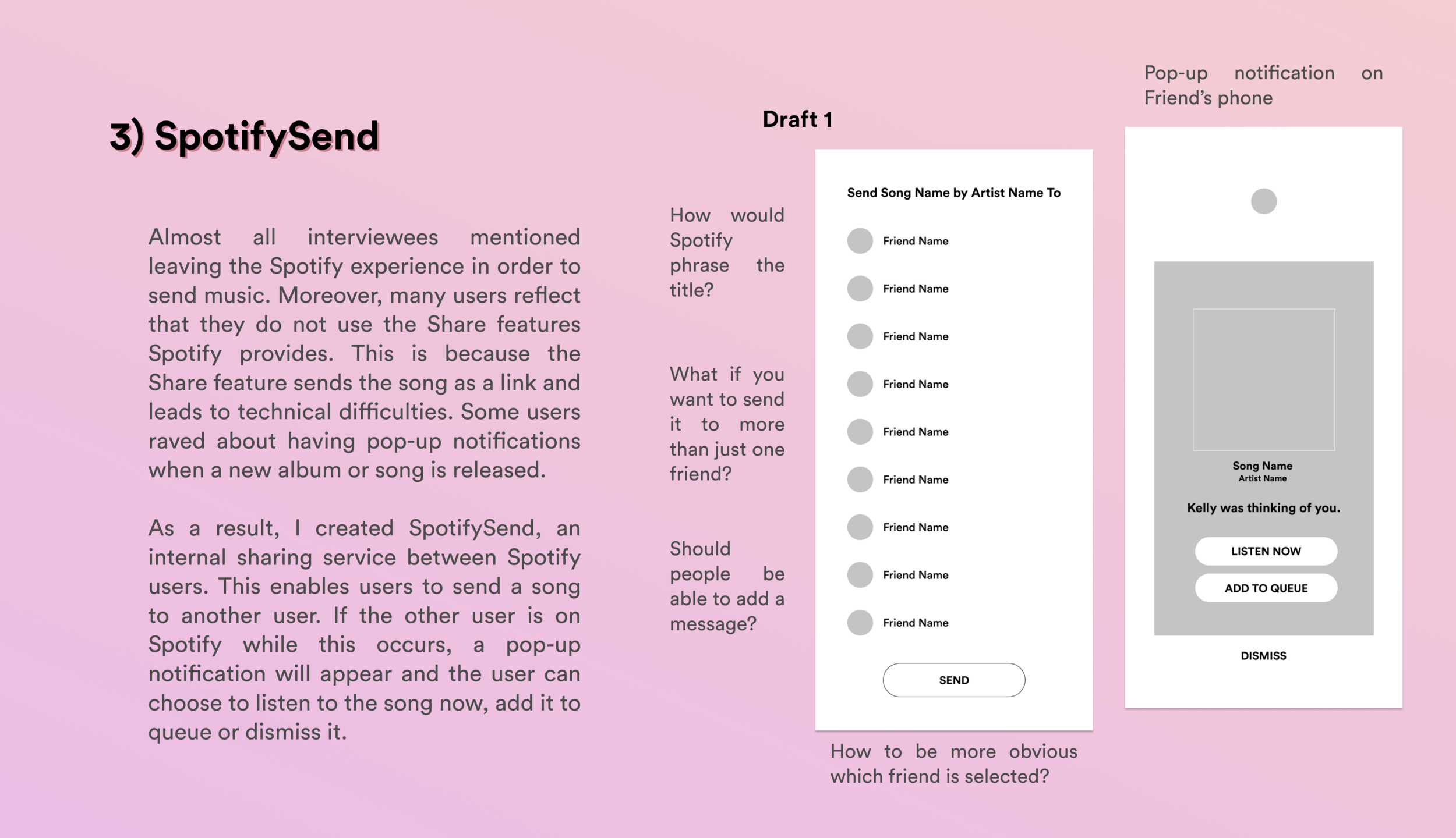
Coupling my fervent music-listening habits with a newfound curiosity for User Experience Design, I decided to tackle some of my personal pet peeves with Spotify. The key component is the difficulty I have when sharing music with friends, requiring me to leave my Spotify sanctuary. With this complication in mind, I delved into the project with the desire to redesign and modify this experience.
Scope:
User Research, UI/UX, Wireframing, Prototyping, User Testing
Tools:
Figma
Survey Results & Interview Questions

After brainstorming a few features I’d like to add to Spotify and critiquing some I’d like to redesign, I set out to understand my potential users better. The initial step was creating and sending out a Screener Survey to find the perfect candidates whose music-listening behavior I would proceed to study and dissect. With a few simple quantitative questions, I narrowed down this pool of people. The diagrams on the right are some results from the 43 respondents. The data was promising and thought-provoking in a few ways. Since the data pointed towards many users who were avid music listeners and Spotify enthusiasts, I knew I could pick the brains of many regarding what they love and hate about Spotify and why. SoundCloud was the 2nd most frequently used platform for Spotify enthusiasts in many instances. This led me to ponder - If a respondent uses both Spotify and SoundCloud, what are the different purposes for each? What features are superior to the other? Would there be ways to draw on other platforms to improve Spotify? Seeing that 82% of respondents share music with others was very reassuring. Do respondents view sharing music and connecting people through music as a vital part of their music listening experience? If so, do they come across the same annoyances I do when trying to do so? What methods do they use to share music? With these thoughts in mind, I began to draft my interview questions, focusing more on the music listening and sharing the experience's qualitative components.

Interviews
While my questions did change from interviewee to interviewee, a few staples when drafting my interview script are below. I interviewed 10 respondents whose no. 1 platform for streaming music is Spotify and 2 respondents whose main platform for streaming music was not Spotify. The key component was to interview 9 respondents who identified music sharers; and 3 respondents who did not identify as music sharers. The interviews were conducted both in-person and over video conferencing.
Personas


Heuristic Analysis
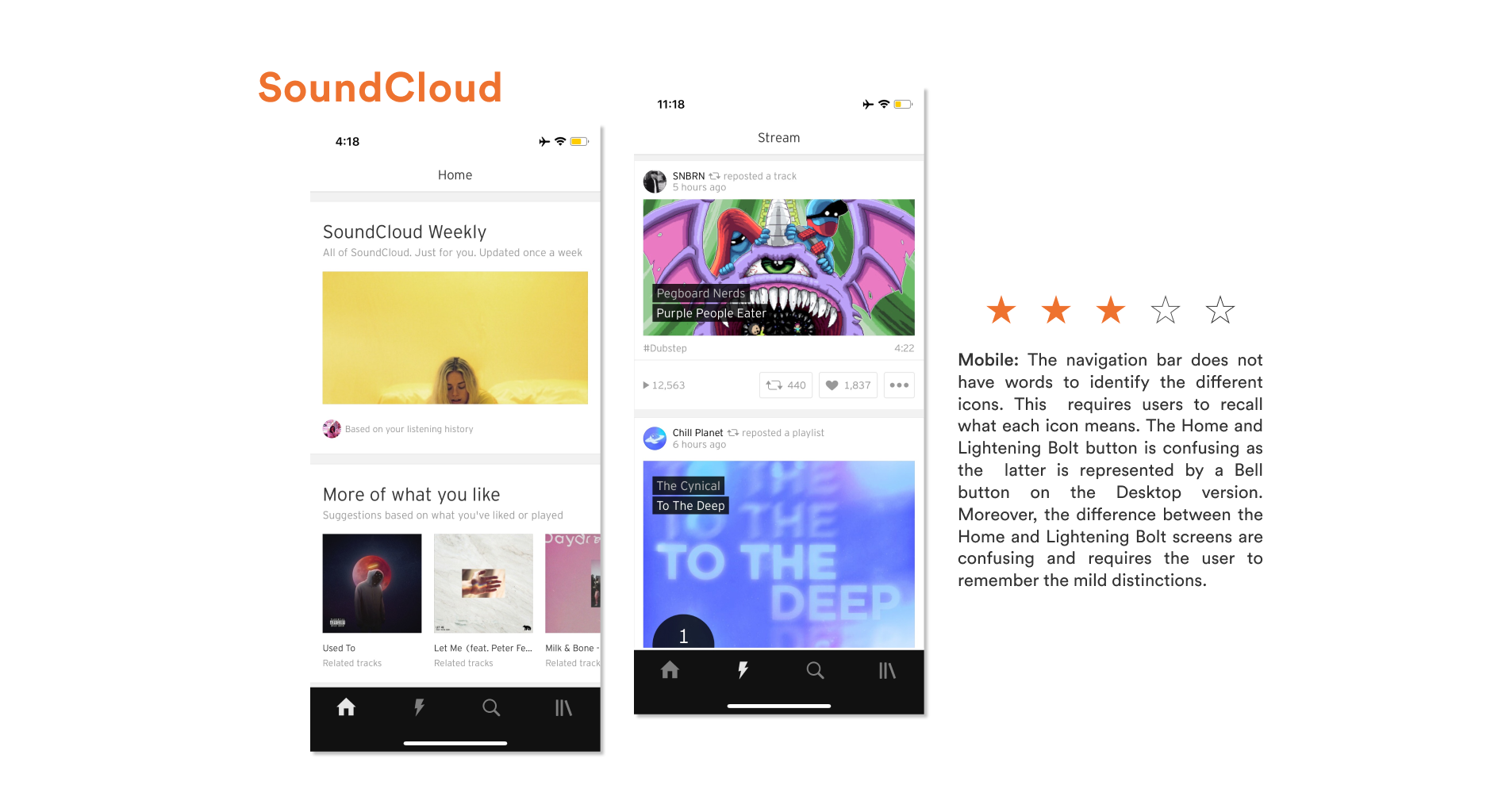
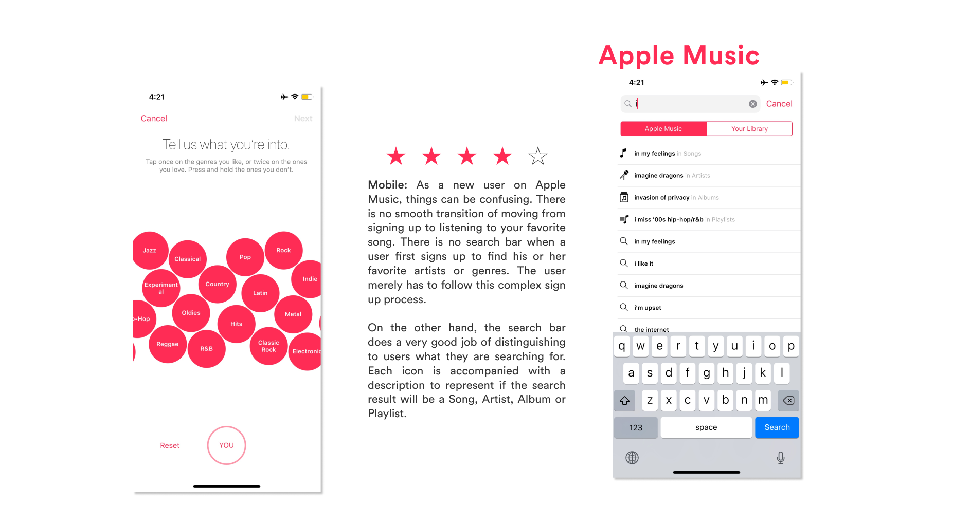
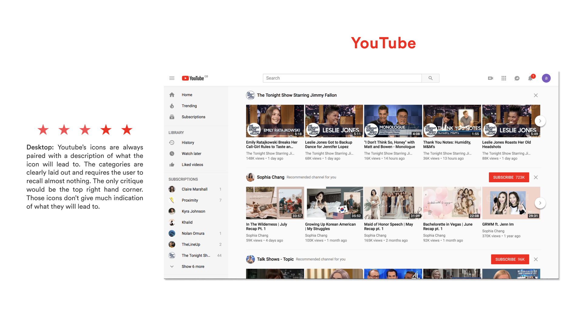
Visibility of System Status: The visibility of system status refers to how well the state of the system is conveyed to its users. Ideally, systems should always keep users informed about what is going on through appropriate feedback within a reasonable time.
Recognition Rather Than Recall: Minimize the user's memory load by making objects, actions, and options visible. The user should not remember information from one part of the dialogue to another. Instructions for using the system should be visible or easily retrievable whenever appropriate.
Card Sort
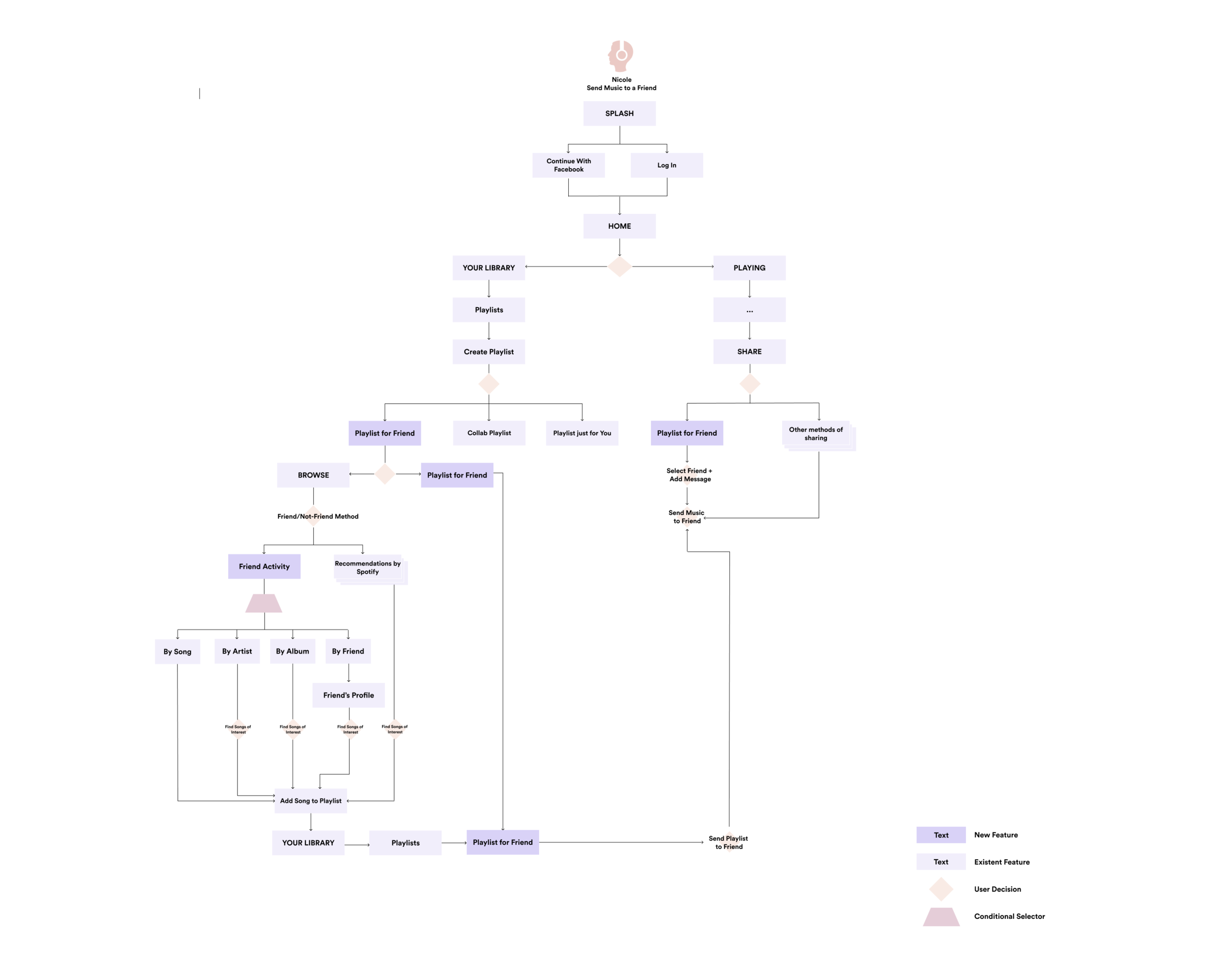
Due to the nature of my Capstone project - creating a new feature for an existing app, Spotify, my card sort required the recruitment of four users who are avid Spotify users and are familiar with the existing structure. As I created the cards, I included both features I aimed to create and those already in existence. This way, I could see how the users would see the new features fitting into the current classifications of Home, Browse, Search, Radio, and Your Library. The users quickly identified most of the classifications and began sorting the interactions and tasks. It was especially interesting to see how the users sorted cards under the Home classification - many were unsure and unfamiliar with what fell into Spotify’s home screen. In fact, none of the users sorted the Home classification in the same manner. Many were unaware that Radio was a classification. While these groupings were not under Spotify’s designated classifications, it was interesting to see the users sort the tasks of “SpotifySend,” “Share,” “Create a Friend Station,” “Create a Playlist to Send to a friend” together. However, sticking to the scope of my redesigning project and adding new features, I cannot adjust the entire site map of Spotify based on these users’ card sorts. I will be taking the information from this card sort to determine where my new features will live best on Spotify’s existing site map.

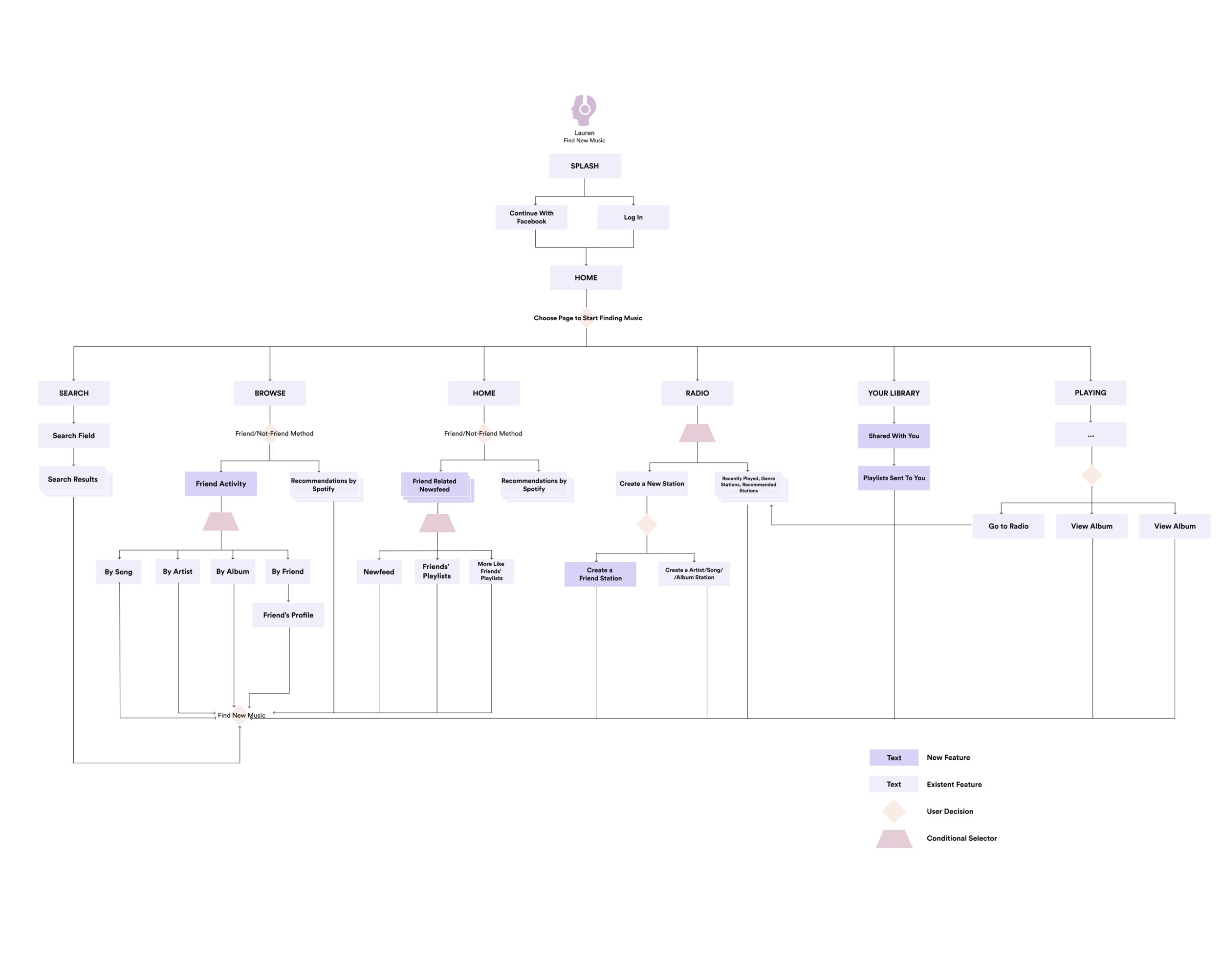
User Flows
Wireframe
My project is to redesign/add new features to an already existing (and amazing) music streaming platform, Spotify. As a result, I have a bit of a head start as many of the pages in my wireframe only require minor tweaking to meet my users’ needs and achieve their goals. The existing screens will be examined more closely as my research has revealed heavier redesign, and even a creation of a new feature will be beneficial to the business and its users.
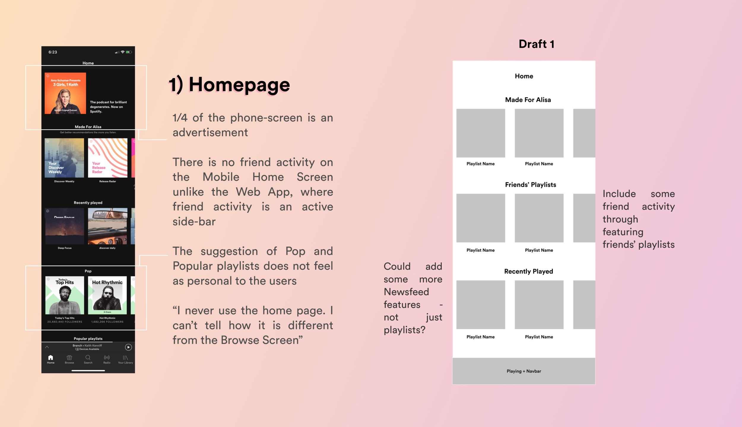
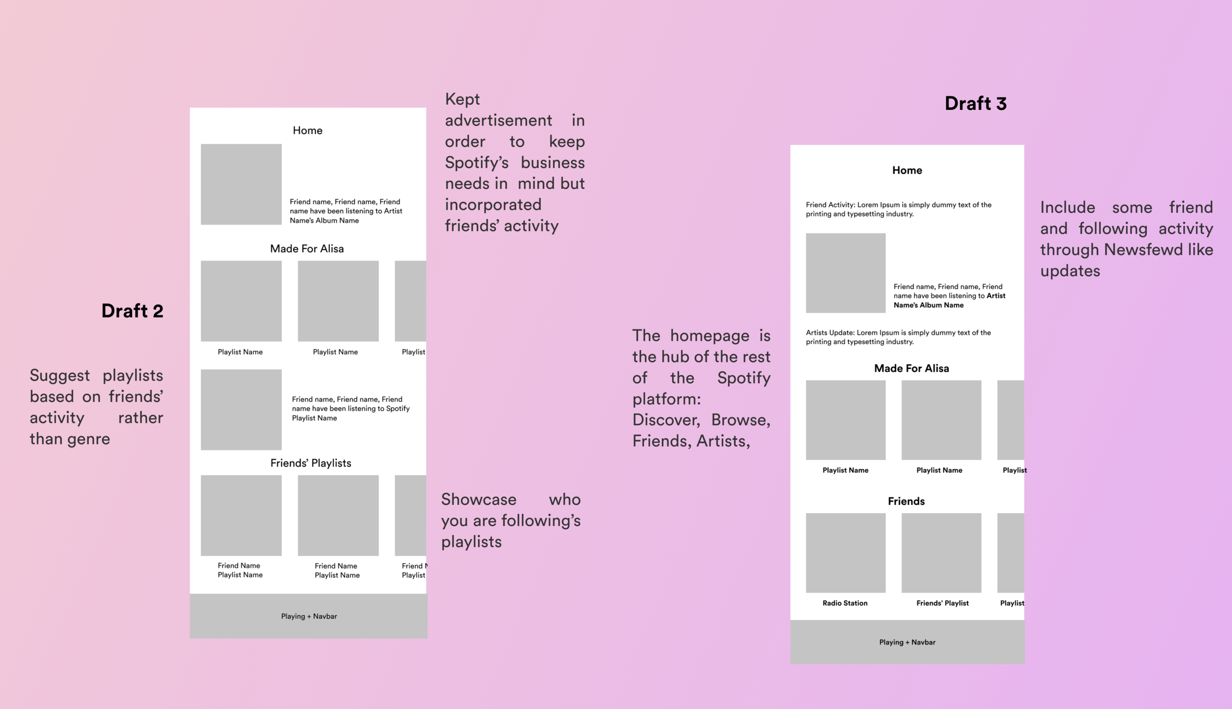
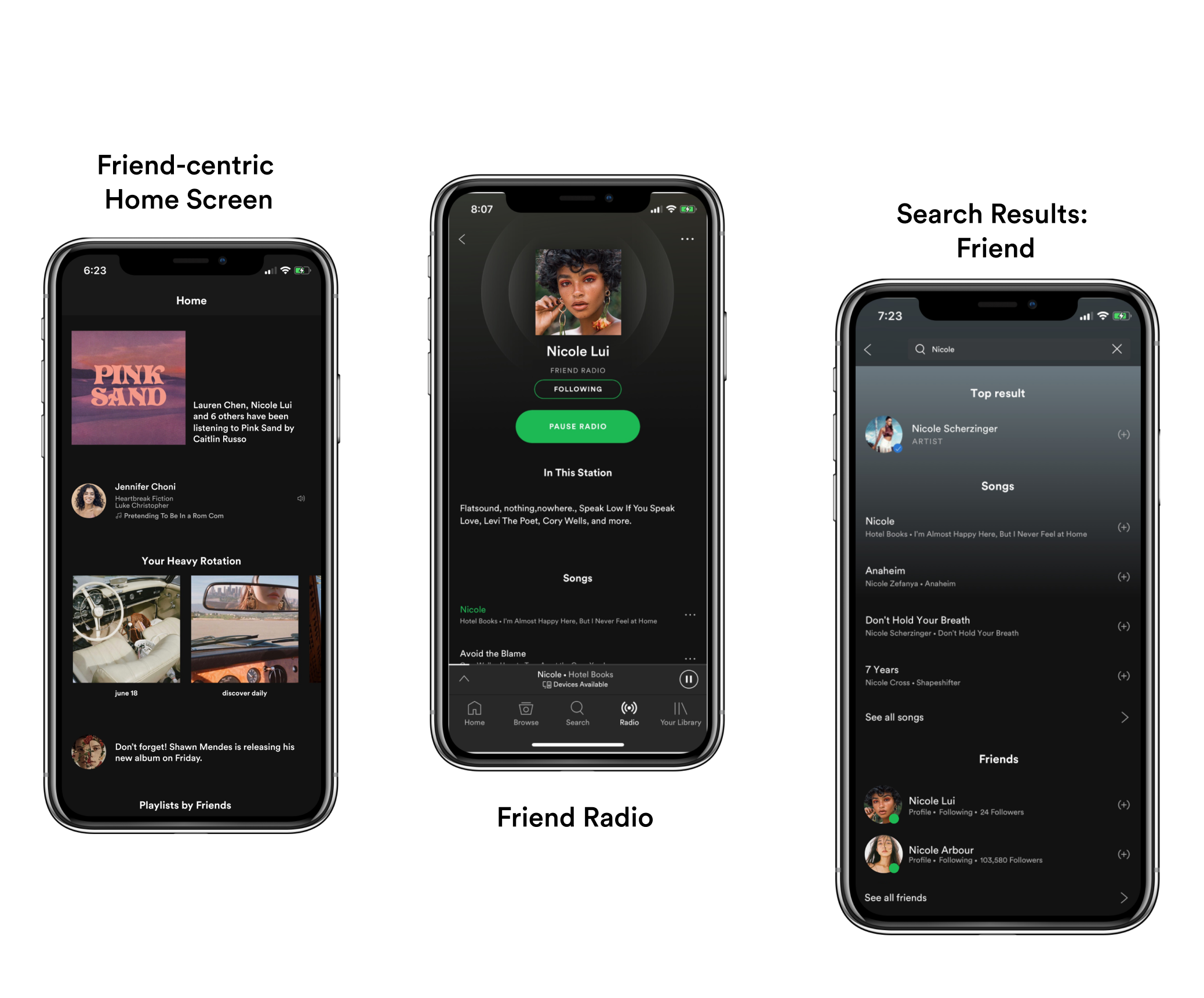
Home Screen
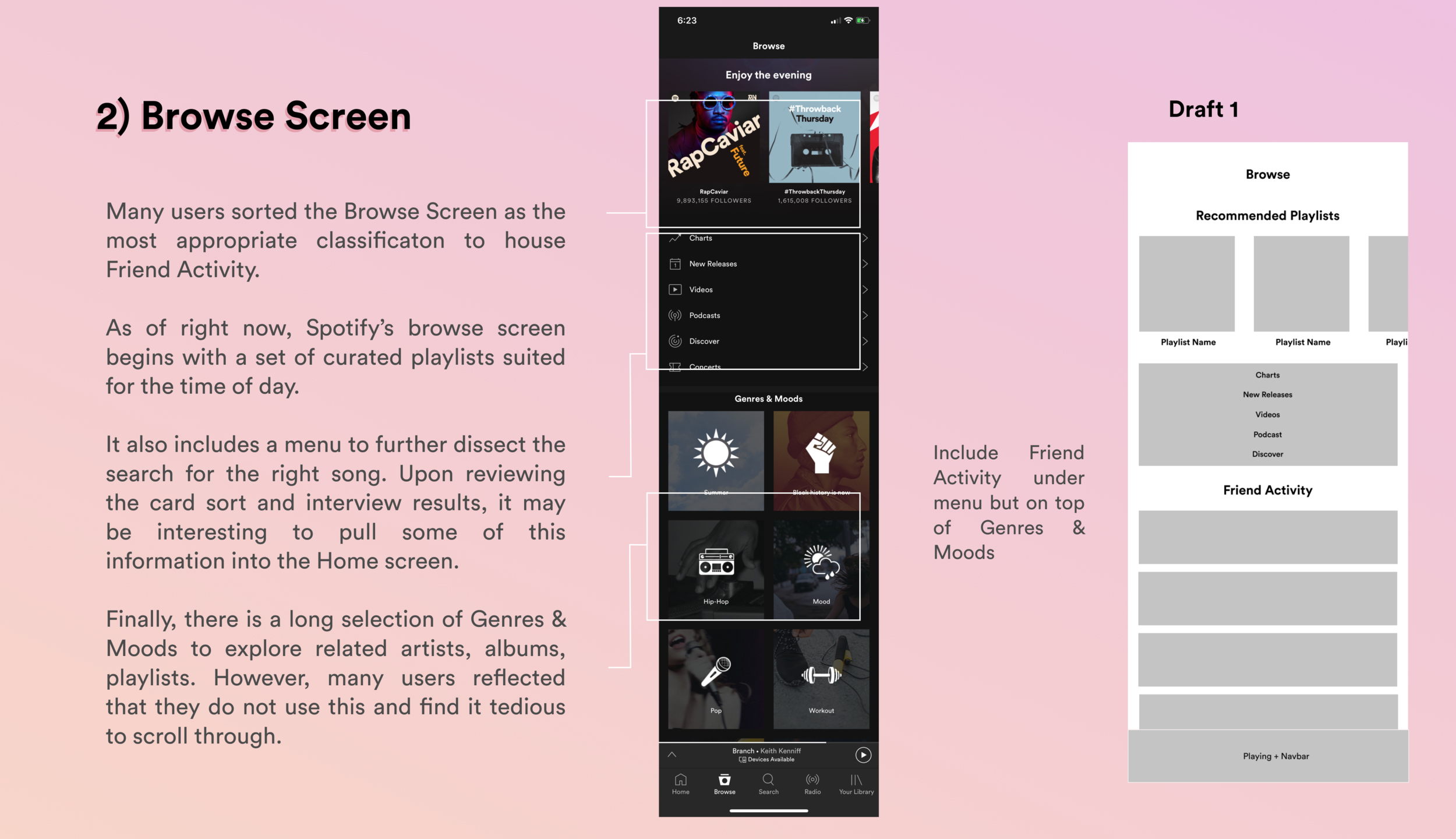
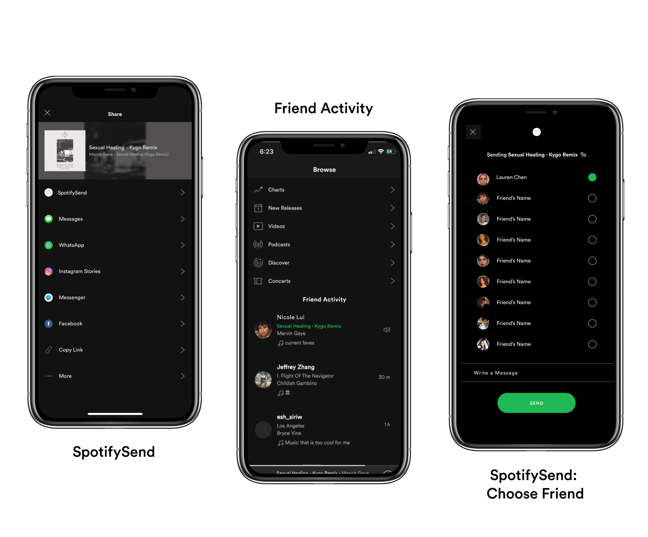
Browse Screen
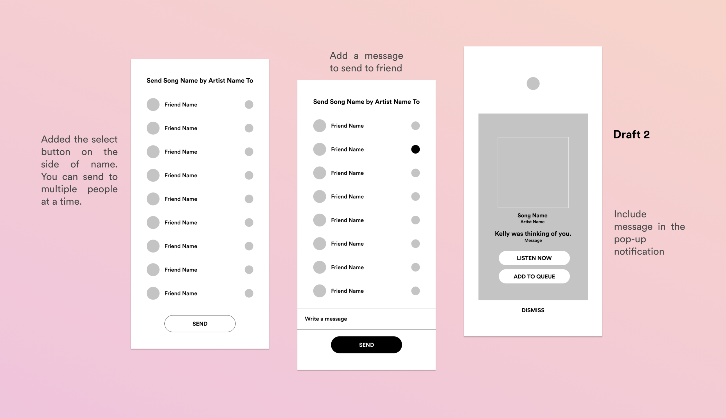
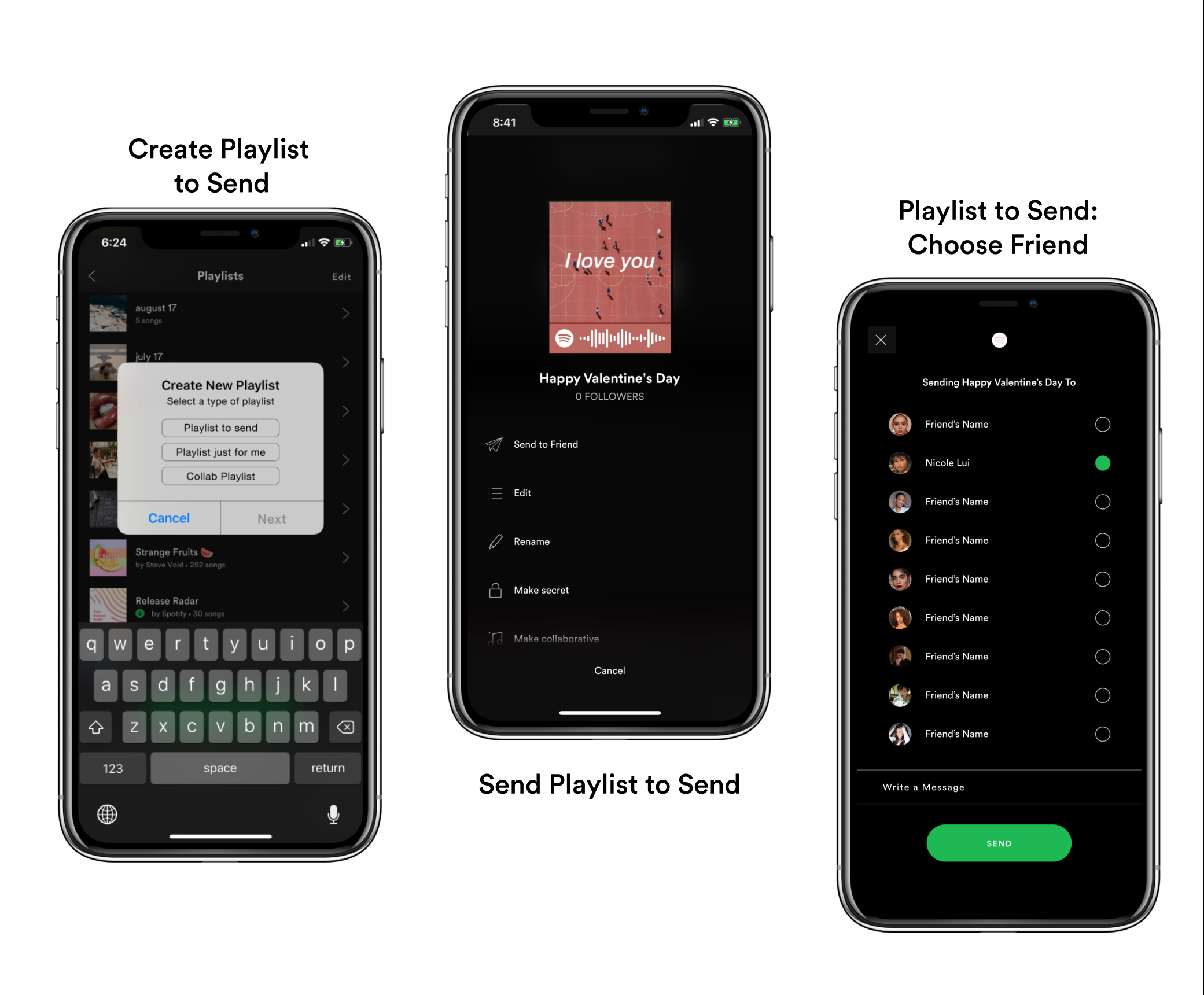
SpotifySend